

Introduction:
A product card UI is a great way to showcase your products on a website or online store. This tutorial will show you how to create an essential product card UI using HTML and CSS. By the end of this tutorial, you will have a solid understanding of how to create your responsive product card UI, and you'll be able to add it to your website or portfolio.
Prerequisites:
Basic understanding of HTML and CSS.
Text editor (e.g., Visual Studio Code, Sublime Text, etc.)
Web browser for testing (e.g., Google Chrome, Mozilla Firefox, etc.)
Setting up the project:
Create a new folder for the project.
Create the necessary files: index.html and style.css.
HTML Structure:
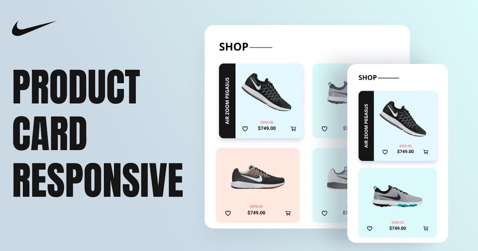
The first step in creating our responsive product card UI is to set up the HTML structure. It features a header with the text "SHOP" and a central section with four article cards. Each card includes a product image, a product name, and pricing information. The price is shown with a strikethrough on the original price and the reduced price next to it. The card also includes two icons: a heart outline and a cart outline. The icons are created using the Ionicons library, which is imported at the end of the code using a script tag.
Steps:
Start the HTML document with the
<!DOCTYPE html>declaration, followed by the<html>tag and anlangattribute with a value of "en".<!DOCTYPE html> <html lang="en"> </html>Add the
<head>section where you specify the character set of the document with the<meta charset="UTF-8">tag. The<meta http-equiv="X-UA-Compatible" content="IE=edge">tag is used to ensure that Internet Explorer uses the latest rendering engine. The<meta name="viewport" content="width=device-width, initial-scale=1.0">tag sets the viewport to the device's width and sets the initial zoom level to 1.<html> <head> <meta charset="UTF-8"> <meta http-equiv="X-UA-Compatible" content="IE=edge"> <meta name="viewport" content="width=device-width, initial-scale=1.0"> </head> </html>Include the
<title>tag to specify the title of the page that will be displayed in the browser's tab.<head> <title>Product Card UI</title> </head>Load a CSS stylesheet with the
<link rel="stylesheet" href="style.css">tag, which defines the styles for the different elements on the page.<head> <link rel="stylesheet" href="style.css"> </head>In the
<body>section, add a<h1>tag with the classtitle-shopand text "SHOP".<body> <h1 class="title-shop">SHOP</h1> </body>Add a
<main>tag with the classmain bd-grid. This is the main container for the product cards.<body> <main class="main bd-grid"></main> </body>Within the
<main>tag, create a<article>tag with the classcardto represent a product card. This tag will be repeated multiple times to create multiple cards.<main class="main bd-grid"> <article class="card"></article> </main>Inside the first
<article>tag, add a<div>tag with the classcard__imgto hold the product image. Include a<img>tag with a source of "img1.png" and analtattribute.<article class="card"> <div class="card__img"> <img src="img1.png" alt=""> </div> </article>Next, add another
<div>tag with the classcard__nameto hold the product name. This tag contains a<p>tag with the text "AIR ZOOM PEGASUS".<article class="card"> <div class="card__name"> <p>AIR ZOOM PEGASUS</p> </div> </article>Then, add another
<div>tag with the classcard__prices. This section will contain the heart icon, the product's price, and the shopping cart icon.<article class="card"> <div class="card__prices"></div> </article>Within the
card__prices<div>, add an anchor tag with the classcard__iconand a<ion-icon>tag with thenameattribute set to "heart-outline". This creates a heart icon that can be used for bookmarking or favoriting the product.<div class="card__prices"> <a href="" class="card__icon"><ion-icon name="heart-outline"></ion-icon></a> </div>Add a
<div>tag to hold the product's price information. This<div>contains two<span>tags with the classescard__price card__price--beforeandcard__price card__price--now. These tags show the original and discounted prices of the product.<div class="card__prices"> <div> <span class="card__price card__price--before">$990.00</span> <span class="card__price card__price--now">$749.00</span> </div> </div>Add another anchor tag with the class
card__iconand a<ion-icon>tag with thenameattribute set to "cart-outline". This creates a shopping cart icon that can be used to add the product to the cart.<div class="card__prices"> <a href="" class="card__icon"><ion-icon name="cart-outline"></ion-icon></a> </div>Repeat the above steps for each product card you want to display on the page.
Finally, include the icon library with the
<script>tag.<script src="<https://unpkg.com/ionicons@5.0.0/dist/ionicons.js>"></script>
CSS Structure:
Once the HTML structure is in place, we can start styling our product card UI using CSS. We use CSS to style the web page, which includes custom variables for color, font, and font size, along with media queries for different screen sizes. It styles various elements such as the body, headings, images, links, and grid items. There is also a hover effect for cards that includes changes in positioning, writing mode, and transformations for certain elements. We use a CSS grid for the layout and make use of custom variables and various CSS properties, such as flexbox, transitions, and absolute positioning.
Steps:
Importing Google Font: The first line of code
importsthe Open Sans font from Google Fonts. This will ensure that the font used on the website is consistent and has a uniform look.@import url("<https://fonts.googleapis.com/css?family=Open+Sans:400,700&display=swap>");Setting CSS Variables: The
:rootselector sets these global variables for the entire document. The next two blocks of code set the colors and font sizes to be used on the website. The colors are defined with the--first-color,--second-color,--third-color,--accent-color, and--dark-colorvariables. The font sizes are defined with the--body-font,--h1-font-size,--h3-font-size,--normal-font-size, and--smaller-font-sizevariables.:root { --first-color: #e3f8ff; --second-color: #dcfafb; --third-color: #ffe8df; --accent-color: #ff5151; --dark-color: #161616; } :root { --body-font: "Open Sans"; --h1-font-size: 1.5rem; --h3-font-size: 1rem; --normal-font-size: 0.938rem; --smaller-font-size: 0.75rem; }Media Queries: The
media queryblock changes the font sizes for larger screen sizes. This is done to ensure the website looks good on both small and large screens.@media screen and (min-width: 768px) { :root { --h1-font-size: 2rem; --normal-font-size: 1rem; --smaller-font-size: 0.813rem; } }Box Sizing: The
*::before, *::afterselector sets the default box-sizing to border-box. This means that the border and padding of an element will be included in its total width and height.*, ::after, ::before { box-sizing: border-box; }Setting Body Properties: The
bodyproperties block sets the font family, color, and margin for the website's body. The font family is set to 'Open Sans'. The color is set tovar(--dark-color).body { margin: 2rem 0 0 0; background-color: #fff; color: var(--dark-color); font-family: var(--body-font); }Setting Headings Properties: The next block sets the font size for the
h1headings. The font size is set tovar(--h1-font-size).h1 { font-size: var(--h1-font-size); }Setting Image Properties: The
imgblock sets the maximum width and height of all images to 100% and 'auto," respectively.img { max-width: 100%; height: auto; }Setting Anchor Properties: The
ablock sets the text-decoration property to 'none' for all anchor tags.a { text-decoration: none; }Setting Main Class Properties: The
.mainblock sets the padding and background color for the main section of the website..main { padding: 2rem 0; }Setting Grid Properties: The
.bd-gridblock sets the display property to 'grid' and defines the grid columns. It also sets the maximum width, margins, and gap between the grid items..bd-grid { display: grid; grid-template-columns: repeat(auto-fit, minmax(220px, 1fr)); max-width: 1200px; margin-left: 2.5rem; margin-right: 2.5rem; align-items: center; gap: 2rem; }Setting Title Shop Properties: The
.title-shopblock sets the position and margin and creates a horizontal line after the title..title-shop { position: relative; margin: 0 2.5rem; } .title-shop::after { content: ""; position: absolute; top: 50%; width: 72px; height: 2px; background-color: var(--dark-color); margin-left: 0.25rem; }Setting Card Properties: The
.cardblock sets the position, display, padding, and border radius for the cards. It also sets the overflow property to "hidden.".card { position: relative; display: flex; flex-direction: column; align-items: center; padding: 1.5rem 2rem; border-radius: 1rem; overflow: hidden; }Setting Article Properties: The
article:nth-child(n)blocks set the background color for the articles based on their position in the grid.article:nth-child(1) { background-color: var(--first-color); } article:nth-child(2) { background-color: var(--second-color); } article:nth-child(3) { background-color: var(--third-color); } article:nth-child(4) { background-color: var(--second-color); }Setting Card Image Properties: The
.card__imgblock sets the width, height, padding, and transition for the card images..card__img { width: 180px; height: auto; padding: 3rem 0; transition: 0.5s; }Setting Card Name Properties: The
.card__nameblock sets the position, writing mode, transform, and text alignment for the card names. It also sets the background color and font weight..card__name { position: absolute; left: -25%; top: 0; width: 3.5rem; height: 100%; writing-mode: vertical-rl; transform: rotate(180deg); text-align: center; background-color: var(--dark-color); color: #fff; font-weight: bold; transition: 0.5s; }Setting Card Icon Properties: The
.card__iconblock sets the font size and color for the card icons. It also sets the hover color tovar(--accent-color)..card__icon { font-size: 1.5rem; color: var(--dark-color); } .card__icon:hover { color: var(--accent-color); }Setting Card Price Properties: We start by defining the
.card__pricescomponent. We will use CSS to specify the width of the card to be 100% and use Flexbox to align the content within the card..card__prices { width: 100%; display: flex; justify-content: space-between; align-items: flex-end; transition: 0.5s; }Setting Card Price Properties: Next, we will add the text content to the
.card__price. This will include the product name, before price, and current price. To align the text, we will center it and specify the font size and color..card__price { display: block; text-align: center; } .card__price--before { font-size: var(--smaller-font-size); color: var(--accent-color); margin-bottom: 0.25rem; } .card__price--now { font-size: var(--h3-font-size); font-weight: bold; }Add Hover Effects to the Card: To make the
cardmore interactive, we will add hover effects to it. This will include adding a box shadow and rotating the image..card:hover { box-shadow: 0 0.5rem 1rem #d1d9e6; } .card:hover .card__name { left: 0; } .card:hover .card__img { transform: rotate(30deg); margin-left: 3.5rem; } .card:hover .card__precis { margin-left: 3.5rem; padding: 0 1.5rem; }Make the card responsive: Finally, we will make the card responsive using
media queries. This will ensure that the card looks good on different screen sizes.@media screen and (min-width: 1200px) { body { margin: 3rem 0 0 0; } .title-shop { margin: 0 5rem; } .bd-grid { margin-left: auto; margin-right: auto; } }
Putting it all together:
Once we have completed the process of constructing our HTML structure and implementing the necessary CSS styling, we are then ready to bring all of these elements together to form our final product. The interface allows users to easily access and interact with product information and is designed to be seamless and user-friendly. With the combination of a well-designed HTML structure and tasteful CSS styling, we can ensure that our final product is not only functional but also aesthetically pleasing.
Conclusion:
In this tutorial, we meticulously demonstrated the process of constructing an effective and dynamic product card user interface utilizing HTML and CSS. The objective of this tutorial was to provide you with a strong foundation of knowledge on how to create a visually appealing and functional profile card user interface. As a result of completing this tutorial, you should now possess the capability to create your very own profile card user interface and incorporate it into your website or online portfolio with confidence. This newfound ability will undoubtedly enhance the overall aesthetic and functionality of your web presence.
If you happen to have any inquiries, doubts, or issues that require clarification or assistance, please feel free to contact me without hesitation. I am always available to provide you with any necessary support or information that you may require, and I am dedicated to ensuring that all of your needs and concerns are met to the best of my ability. Therefore, if you ever need any further help, guidance, or advice, don't hesitate to reach out to me, as I am committed to helping you in any way that I can.
If you found this article enjoyable and informative, I would be truly grateful if you would consider supporting my work by buying me a coffee. Simply click on the button below to show your appreciation and help me continue pursuing my dream. Thank you for taking the time to read this, and I hope you have a wonderful day ahead!
Thank you!