

Introduction:
Animated profile card UI's are a great way to showcase personal or professional information in a visually pleasing and interactive way. This tutorial will show you how to create your animated profile card UI using HTML, CSS, and JavaScript. By the end of this tutorial, you will have a solid understanding of how to create your profile card UI, and you'll be able to add it to your website or portfolio.
The UI is defined using CSS styles. The CSS uses various CSS variables, such as --color-bg, --color-card, --color-text, etc., to store color values. This helps make the code more readable and maintainable.
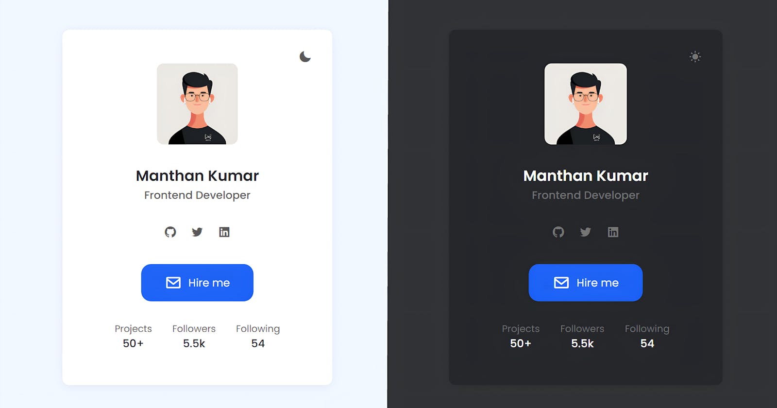
The HTML is structured with a container that holds a card element. The card element contains the profile picture, name, occupation, social media links, and a button. The social media links are displayed in a list and styled using CSS.
There is also a dark theme defined in the CSS that changes the color scheme of the UI when the dark-theme class is added to the body element.
The fonts used in the UI are imported from Google using link elements. Box icons are also imported from a CDN using an link element.
Prerequisites:
Basic understanding of HTML, CSS, and JavaScript.
Text editor (e.g., Visual Studio Code, Sublime Text, etc.)
Web browser for testing (e.g., Google Chrome, Mozilla Firefox, etc.)
Setting up the project:
Create a new folder for the project.
Create the necessary files: index.html, style.css, and script.js .
HTML Structure:
The first step in creating our animated profile card UI is to set up the HTML structure. The main elements of our HTML structure include a container div, an image element, a toggle button, and an information section. The container div serves as the overall container for the card, the image element displays the profile picture, the toggle button allows the user to show and hide the information section, and the information section contains personal or professional information.
Steps:
First, we have a
bodyelement that contains all the HTML content of the web page.<body> </body>Inside the
bodytag, there is adivelement with the class "container". This element is used to center and contain the other elements on the page.<body> <!-- Container --> <div class="container"></div> </body>Within the
containerdiv, there is anotherdivelement with a class of "card". This element represents the main section of the profile card.<div class="container"> <!-- Card --> <div class="card"></div> </div>Inside the "card" div, there is
ian element with anidof "theme-toggle" and a class of "bx bxs-moon theme_toggle". This element represents a toggle button for changing the theme of the card.<div class="card"> <!-- Theme Toggle --> <i id="theme-toggle" class='bx bxs-moon theme_toggle' ></i> </div>Next, there is an
imgelement that displays the profile image of the person. Thesrcattribute specifies the URL of the image, and thealtattribute provides a text description of the image in case it can't be loaded.<div class="card"> <!-- Profile Image --> <img src="" alt="" class="card_img"> </div>Inside the "card" div, there is a
divelement with a class of "card_body". This element contains the main information about the person, such as their name, occupation, and social media links.<div class="card"> <!-- Card Body --> <div class="card_body"></div> </div>Within the "card_body" div, there is an
h2element with a class of "card_name" that displays the person's name.<div class="card_body"> <h2 class="card_name"></h2> </div>There is also a
spanelement with a class of "card_occupation" that displays the person's occupation.<div class="card_body"> <span class="card_occupation"></span> </div>The "card_body" div also contains an unordered list (
ul) with the class "social_list" that displays the person's social media links. Each list item (li) contains a link (a) to the person's social media profile, along with an icon (i) that represents the type of social media.<div class="card_body"> <!-- Social List --> <ul class="social_list"> <li class="social_item"> <a href="#" class="social_link" ><i class='bx bxl-github'></i></a> </li> <li class="social_item"> <a href="#" class="social_link" ><i class='bx bxl-twitter'></i></a> </li> <li class="social_item"> <a href="#" class="social_link" ><i class='bx bxl-linkedin-square'></i></a> </li> </ul> </div>The "card_body" div also contains a link (
a) with a class of "card_button" that displays a button to contact the person.<div class="card_body"> <!-- Contact Button --> <a href="#" class="card_button"><i class='bx bx-envelope'></i></a> </div>Finally, there is a
divelement with a class of "card_footer" that displays some statistics about the person, such as the number of projects, followers, and people they follow. Each statistic is displayed in a separatedivelement with a class of "card_data".<!-- Card Footer --> <div class="card_footer"> <!-- Card Data --> <div class="card_data"> <h3 class="card_data_title"></h3> <span class="card_data_number"></span> </div> <div class="card_data"> <h3 class="card_data_title"></h3> <span class="card_data_number"></span> </div> <div class="card_data"> <h3 class="card_data_title"></h3> <span class="card_data_number"></span> </div> </div>
CSS Styling:
Once the HTML structure is in place, we can start styling our profile card UI using CSS. We use CSS to style the container div, the image element, the toggle button, and the information section. This includes setting the overall layout, size, and design of the card. Some of the CSS properties used include width, height, background color, and border radius.
Steps:
Global CSS Variables: The first section of the code defines some CSS variables, which can be reused throughout the code. The
:rootselector sets these global variables for the entire document. The variables include colors for the background, text, primary theme, etc.:root { --color-bg: #f1f5ff; --color-card: #fff; --color-primary: #1e5ef3; --color-primary-light: #3d77ff; --color-text: #565656; --color-title: #232429; --color-white: #fff; --box-shadow: 0 4px 15px rgba(0, 0, 0, 0.05); }Dark Theme: The
body.dark-themeselector defines the same variables, but with different values to create a dark theme.body.dark-theme { --color-bg: #2f3034; --color-card: #232429; --color-text: #747474; --color-title: #fff; }Box-sizing and Default Margin/Padding: The
, *::before, *::afterselector sets the default box-sizing to border-box, which includes padding and borders in an element's total width and height, and sets the default margins and padding to 0.*, *::before, *::after { box-sizing: border-box; margin: 0; padding: 0; }Font Size: The
htmlselector sets the font size for the entire document to 62.5%.html { font-size: 62.5%; }Body Styles: The
bodyselector sets the default styles for the body of the document, such as background color, font family, font size, and height.body { background: var(--color-bg); font-family: "Poppins", sans-serif; font-size: 1.6rem; height: 100vh; }Container Styles: The
.containerselector sets styles for a container element, such as height, display, and padding..container { height: 100%; display: grid; place-items: center; padding: 2rem; }Card Styles: The
.cardselector sets styles for a card component, such as background color, shadow, padding, border radius, etc..card { position: relative; background: var(--color-card); box-shadow: var(--box-shadow); padding: 5rem 3.5rem; border-radius: 1rem; width: 100%; max-width: 40rem; color: var(--color-text); transition: 0.4s; }Card Image Styles: The
.card_imgselector sets styles for a card image, such as display, width, and margin..card_img { display: block; width: 100%; max-width: 12rem; margin: auto; margin-bottom: 3rem; border-radius: 1rem; }Card Body Styles: The
.card_bodyselector sets styles for the body of a card, such as text alignment and margin..card_body { text-align: center; margin-bottom: 3rem; }Card Title Styles: The
.card_nameselector sets styles for the title of a card, such as font size, color, and weight..card_name { color: var(--color-title); font-size: 2.2rem; font-weight: 600; }Card Occupation Styles: The
.card_occupationselector sets styles for the occupation of a person on a card, such as font-weight..card_occupation { font-weight: 500; }Social List Styles: The
.social_listselector sets styles for the social media links list, such as display, justify-content, and margin..social_list { display: flex; justify-content: center; margin: 3rem 0; column-gap: 2rem; list-style: none; }Social Link Styles: The
.social_linkselector sets styles for the social media links, such as font size, color, and transition..social_link { font-size: 2rem; color: var(--color-text); text-decoration: none; transition: 0.4s; } .social_link:hover { color: var(--color-primary); }Social Item Styles: The
.social_itemselector sets styles for the social media list items, such as transition..social_item { transition: 0.4s; } .social_item:hover { transform: translateY(-30%); }Card Button Styles: The
.card_buttonselector sets styles for a button in a card, such as a background color, text decoration, and transition..card_button { display: inline-flex; align-items: center; column-gap: 1rem; padding: 1.5rem 3.5rem; text-decoration: none; background: var(--color-primary); color: var(--color-white); border-radius: 15px; transition: 0.4s; } .card_button i { font-size: 2.5rem; } .card_button:hover { background: var(--color-primary-light); }Card Footer Styles: The
.card_footerselector sets styles for the footer of a card, such as display, justify-content, and text-align..card_footer { display: flex; justify-content: center; align-items: center; text-align: center; column-gap: 3rem; }Card Data Styles: The
.card_data_titleand.card_data_numberselectors set styles for the data in a card, such as font size and color..card_data_title { font-size: 1.4rem; font-weight: normal; } .card_data_number { color: var(--color-title); font-weight: 500; }Theme Toggle Styles: The
.theme_toggleselector sets styles for a theme toggle button, such as position, font size, and cursor..theme_toggle { position: absolute; top: 3rem; right: 3rem; font-size: 2rem; cursor: pointer; transition: 0.4s; } .theme_toggle:hover { color: var(--color-title); }
JavaScript Functionality:
Now that the HTML structure and CSS styling are in place, we can add the JavaScript functionality to our profile card UI. The JavaScript code is used to create the toggle functionality for the information section. This allows the user to show and hide the information section as needed.
Steps:
It starts by getting an element with the ID "theme-toggle" and storing it in the
themeToggleconstant variable.const themeToggle = document.getElementById("theme-toggle");The code then adds a click event listener to the
themeToggleelement.themeToggle.addEventListener("click")When the
themeToggleelement is clicked, and an anonymous function is executed. This function has the following steps:themeToggle.addEventListener("click", () => { }The first step inside the function is to toggle the "dark-theme" class on the
document.bodyelement.document.body.classList.toggle("dark-theme");The next step is to check whether the
document.bodyelement has the "dark-theme" class.if (document.body.classList.contains("dark-theme")) { }If it does, the code replaces the class "bxs-moon" with "bxs-sun" on the
themeToggleelement.if (document.body.classList.contains("dark-theme")) { themeToggle.classList.replace("bxs-moon", "bxs-sun"); }If it does not, the code replaces the class "bxs-sun" with "bxs-moon" on the
themeToggleelement.else { themeToggle.classList.replace("bxs-sun", "bxs-moon"); }The result of this code is that when the
themeToggleelement is clicked, it toggles the "dark-theme" class on the body element and changes the class on thethemeToggleelement, which can be used to change the appearance of the toggle button to reflect the state of the theme.
Putting it all together:
Once we have our HTML structure, CSS styling, and JavaScript functionality, we can put it all together to create our final product. The HTML, CSS, and JavaScript work together to create a visually pleasing and interactive profile card UI that allows the user to view and access personal or professional information.
Conclusion:
In this tutorial, we have shown you how to create an animated profile card UI using HTML, CSS, and JavaScript. You should now have a solid understanding of how to create your profile card UI, and you'll be able to add it to your website or portfolio.
If you happen to have any inquiries, doubts, or issues that require clarification or assistance, please feel free to contact me without hesitation. I am always available to provide you with any necessary support or information that you may require, and I am dedicated to ensuring that all of your needs and concerns are met to the best of my ability. Therefore, if you ever need any further help, guidance, or advice, don't hesitate to reach out to me, as I am committed to helping you in any way that I can.
If you found this article enjoyable and informative, I would be truly grateful if you would consider supporting my work by buying me a coffee. Simply click on the button below to show your appreciation and help me continue pursuing my dream. Thank you for taking the time to read this, and I hope you have a wonderful day ahead!
Thank you!