


Table of contents
Introduction
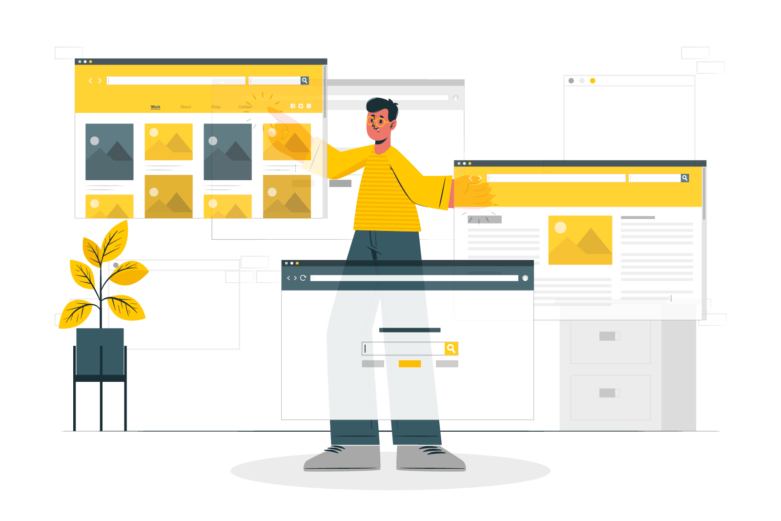
In today's digital age, responsive web design has become a crucial aspect of creating a successful online presence. With the increasing variety of devices and screen sizes, websites need to adapt and provide an optimal user experience across all platforms. In this blog post, we will explore the art of responsive web design and share some valuable tips and tricks to help you create websites that are visually appealing and function flawlessly across different devices.
1. Embrace Mobile-First Design:
With the growing dominance of mobile devices, adopting a mobile-first design approach is vital. Start the design process by considering the mobile experience as the primary focus. This ensures that the website is optimized for smaller screens and gradually enhanced for larger ones. By prioritizing mobile design, you can ensure a smooth and engaging user experience, regardless of the device.

2. Utilize Responsive Frameworks and Grid Systems:
Responsive frameworks and grid systems provide a solid foundation for building responsive websites. These frameworks, such as Bootstrap and Foundation, offer pre-defined grids, typography styles, and UI components that automatically adjust based on the screen size. They save development time and make it easier to create responsive layouts that adapt seamlessly to different devices.
3. Implement Fluid Layouts:
Fluid layouts are essential for responsive web design. Instead of fixed pixel-based widths, use percentages or relative units (such as em or rem) for layout components. This allows the website to adjust dynamically to fit any screen size, ensuring that content remains readable and accessible.

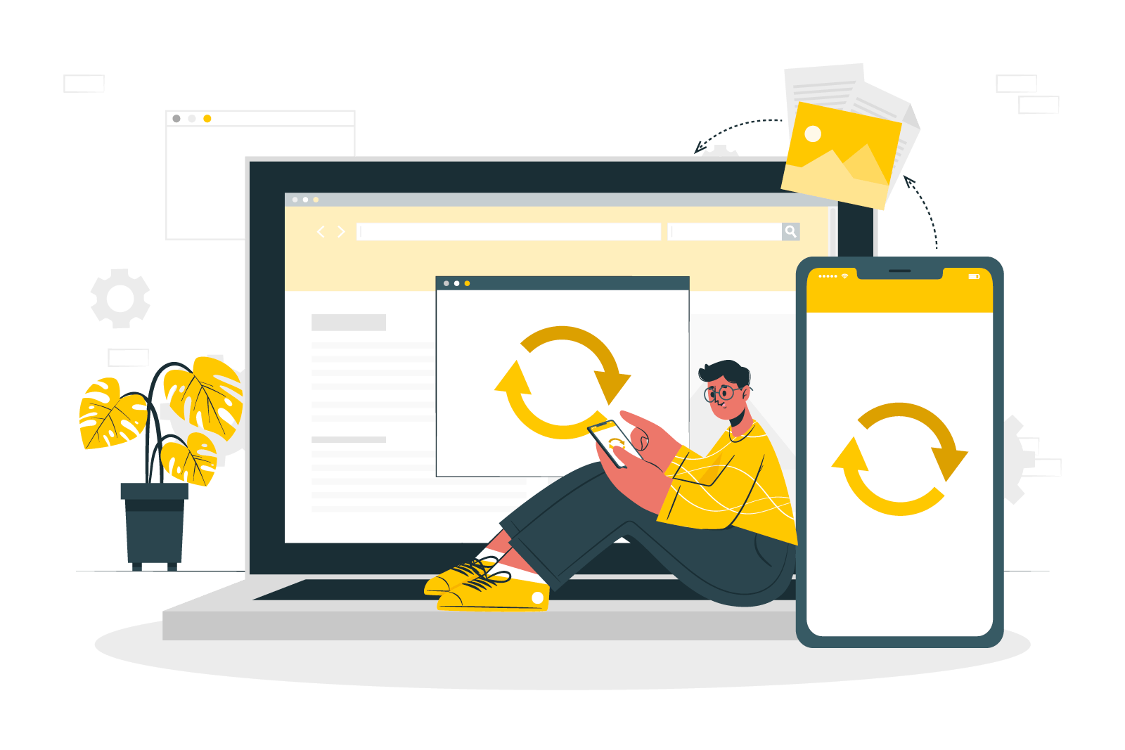
4. Optimize Images for Different Resolutions:
Images play a crucial role in web design, but they can also impact page load times, especially on mobile devices with limited bandwidth. Optimize images by using responsive image techniques such as srcset and sizes attributes, which enable the browser to select and load the appropriate image based on the user's device and screen resolution. Additionally, consider using modern image formats like WebP, which provide better compression and faster loading times.
5. Prioritize Content and Hierarchy:
On smaller screens, the content hierarchy becomes even more critical. Prioritize the most important content and ensure it is easily accessible. Use responsive typography techniques to adjust font sizes and line heights based on the screen size. Break content into digestible sections and consider collapsible menus or accordions to save screen space and provide a seamless browsing experience.

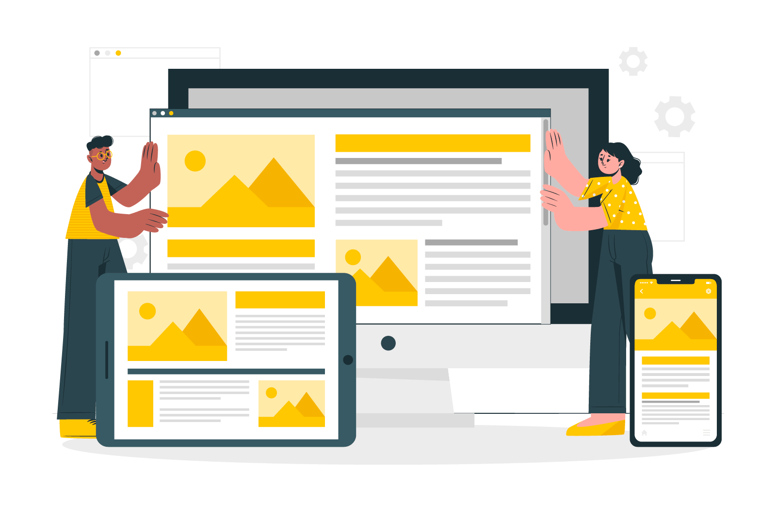
6. Test Across Multiple Devices and Browsers:
Responsive web design requires thorough testing on a variety of devices, browsers, and operating systems. Use tools like browser developer tools, responsive design testing platforms, and physical devices to ensure your website looks and functions as intended across different environments. Pay attention to issues such as layout inconsistencies, broken elements, and performance bottlenecks.
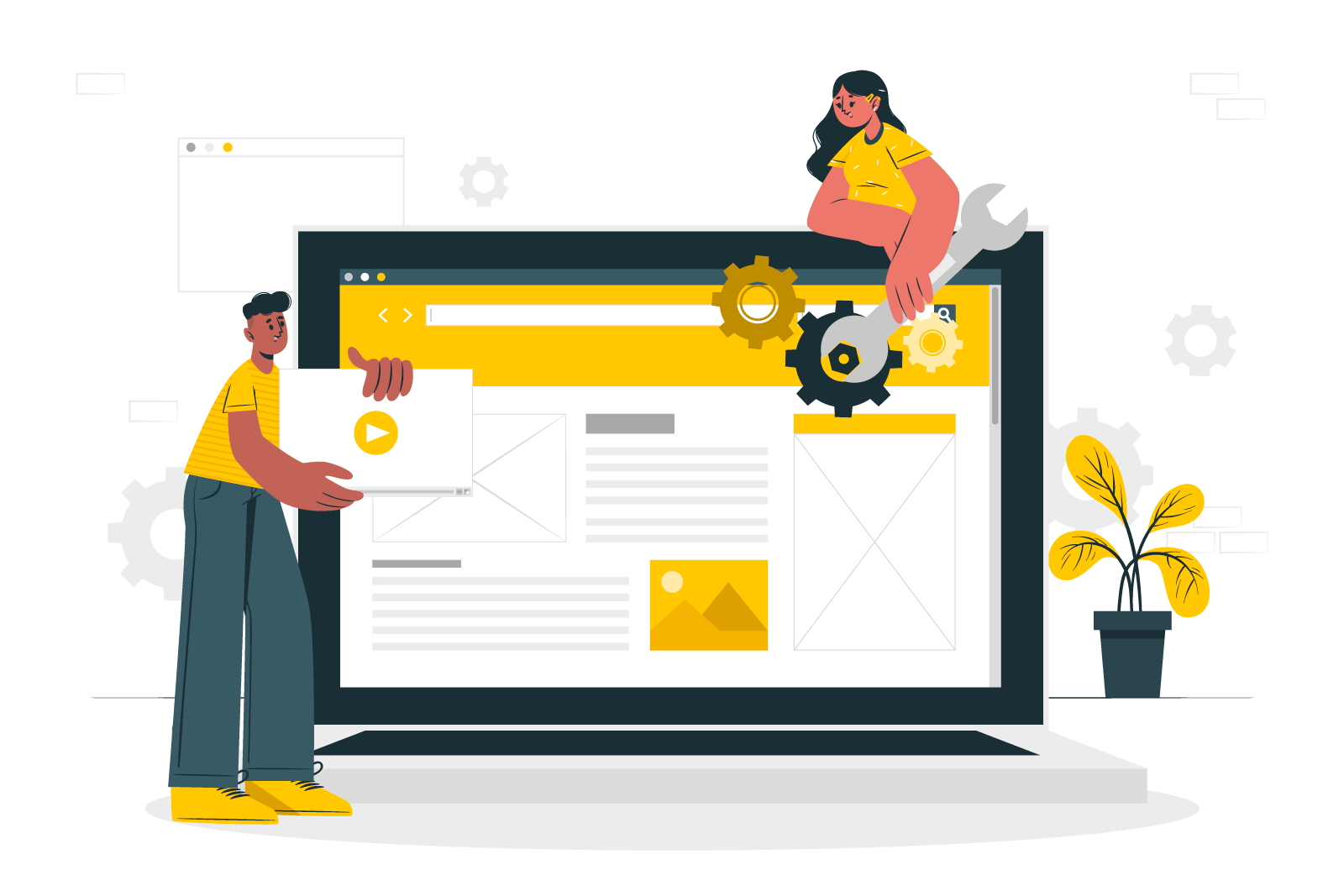
7. Performance Optimization:
Responsive design should not come at the cost of performance. Optimize your website by minifying and compressing CSS and JavaScript files. Implement lazy loading techniques for images and videos to reduce initial page load times. Additionally, prioritize critical above-the-fold content to enhance perceived performance, ensuring users can quickly access the most important information.

Conclusion
Responsive web design is a fundamental aspect of modern web development. By following these tips and tricks, you can create visually stunning websites that seamlessly adapt to different devices and provide an outstanding user experience. Remember to prioritize mobile-first design, leverage responsive frameworks and grids, optimize images and content, and thoroughly test across various devices and browsers. With a focus on responsive design, you can elevate your web development skills and create websites that thrive in our increasingly mobile-driven world.

If you happen to have any inquiries, doubts, or issues that require clarification or assistance, please feel free to contact me without hesitation. I am always available to provide you with any necessary support or information that you may require, and I am dedicated to ensuring that all of your needs and concerns are met to the best of my ability. Therefore, if you ever need any further help, guidance, or advice, don't hesitate to reach out to me, as I am committed to helping you in any way that I can.
If you found this article enjoyable and informative, I would be truly grateful if you would consider supporting my work by buying me a coffee. Simply click on the button below to show your appreciation and help me continue pursuing my dream. Thank you for taking the time to read this, and I hope you have a wonderful day ahead!
Thank you!
